Post

WOMANKIND

Leave a reply

11174876_903334636389733_2191364501962816506_n

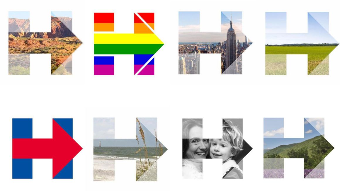
To hear Susan Sarandon tell it, we’ve got plenty of time for a woman President. Yes, she’d like a woman President, the actress and political activist has said, but she wants the ‘right’ woman—by which, she means, Hillary Clinton is not that ‘right’ woman. Implied in this conceit is that there are plenty of Presidential-caliber women waiting in the wings, and if Hillary would just get out of the way, the ‘right’ woman would surely emerge to win over Sarandon’s whole-hearted support.

Whether Hillary Clinton wins or loses on Tuesday, America stands on the cusp of an historic moment, and for those who view Clinton with irrational contempt (Sarandon falls into this category), it is an immensely maddening moment. Rooting against cultural advancement is a deeply frustrating and particularly embittering thing, partly because it is, in the end, a lonely endeavor. For—and this should be duly noted—Clinton’s much-touted unpopularity is mostly a piece of American lore. If Hillary Clinton becomes ‘leader of the free world’ on November 8th, the ‘free’ world’s response—make no mistake—will be equal parts unbridled jubilation and unprecedented relief. Try being on the other side of that.

head-hillary

No one knows this better than Clinton herself, having played would-be foil to our time’s other landmark political moment in 2008. Like much of what Clinton has accomplished, the grace with which she handled her Primary defeat to Barack Obama, her refusal to succumb to the seeds of bitterness, rarely gets the credit it deserves—as if it were a given that a hard-fought race automatically engenders grace. Bernie Sanders’ slow burn and protracted letting-go provided a stark contrast to Clinton’s concession speech eight years ago—one that, in today’s considerably more mean-spirited climate, looks almost quaint in its surrender. And, lest we forget, should Clinton win on Tuesday, an apotheosis of graceless defeat looms menacingly on the horizon. (Though, one suspects, grace from the opposing side will be at a premium, irrespective of the outcome).

The irony of Sarandon’s ‘right’ woman thesis is that there may never be a more rightful woman to assume this rarefied mantle than Hillary Rodham Clinton at this very moment. Because if this interminable political season has exposed one thing starkly, it is just how much latitude is still accorded a man, and just how much a woman must still accomplish before she’s allowed into the same hallowed arena. The chasm that lies between our two choices—whether on the basis of intellect, experience, character, or fortitude —is historically monumental, shockingly clear. But, at this late date, it is also moot. Its relevance matters only inasmuch as it stands as a testament to how much voters are willing to overlook or forgive—in a man.

If it’s true that politics is personal, there has never been a more personal election for women (and, yes, men) than this one—and how those personal feelings manifest themselves in the voting booth will say something, for better or worse, about who we are. Susan Sarandon will have plenty of company in dismissing this occasion as simply one in a long line of opportunities to come. But those of us who know better, who understand gravity when we see it, won’t be so cavalier. We’ll vote with an eye toward history, wholly in awe of a singular woman and her Herculean feat in the face of impossible odds—and raise a glass to womankind.

Post

BLACK HEART: Fiona Banner Interprets Joseph Conrad

1 comment

Heat of Darkness by Fiona Banner

When you hit upon a memorable book title—and Joseph Conrad certainly did that way back in 1899—the book’s cover design is rightfully expected to give the title (and the story it encapsulates) equally memorable visual expression. The dozens of book cover designers of Conrad’s classic—and devastatingly bleak—novel have mostly taken a woefully literal approach, presenting various tableaux of generic landscapes and jungle scenes to illustrate the book’s brutal Congolese setting.

British artist Fiona Banner’s Heart of Darkness, a reinterpretation of Conrad’s story as a contemporary photographic essay, brings a modernist designer’s austere sensibility to the publication’s cover design, and, quite simply, gets to the heart of the matter. Seems Banner, an artist celebrated for her text-based compositions, knows that words this eloquent and powerful deserve to stand alone—in the dark.

Fiona Banner Heart of Darkness

Via Four Corner’s Books, Fiona Banner

Post

HEART SHAPED WORLD: Love-Laced Maps from Melissa Schwall

1 comment

Map of Our Hearts2

That we find great romance in maps is a given. We may deem them indispensable in the moment, but our attachment to old fashioned printed maps tends to linger long after the moment has passed—when the creased and stained travel maps we’ve crammed into our purses and pockets have morphed into our lives’ ephemera, reminders of where we come from, where we’ve been, and where we wish we had gone. Try getting all that from a Google map.

Designer Melissa Schwall gives map adoration a winsome, literal spin. Schwall, whose work can be found amongst the novel hand-crafted offerings at Uncommon Goods, has applied her romantic worldview to a collection of made-to-order collages designed for lovers, in which two halves of a heart, each carefully extracted from a specific area of a new or vintage paper map, are brought together to form a single fully-formed heart—creating a graphic illustratiom of the merging of two disparate worlds.  Personalized copy completes the art piece. which Schwall creates by hand, and delivers framed.

Schwall is amongst a range of artists, designers, and craftspeople featured on Uncommon Goods, a Brooklyn-based online marketplace for quirky, inventive home decor, fashion, and artworks, sourced directly from the original makers. Sustainability and social responsibility—in addition to the championing of a select group of creatives who ply their trade by hand—lies at the heart of the company ethos. Uncommon stuff.


Map of Our Hearts


Map of Our Hearts3

Post

DOGGED ATTENTION: A Canine Alphabet by Andrei Clompos

1 comment

Dog Alphabet A by Andrei Clompos
What’s a graphic designer to do when he loves both typography and dogs? Find a way to marry the two, of course. That’s precisely what Romanian designer Andrei Clompos has done with his Dog Alphabet, a self-initiated project in which he’s juxtaposed dog breeds with their related letterforms. Some illustrations are cleverer than others—the Weimaraner is a wow—but all offer an excuse for dog lovers to wallow in the unmitigated cuteness of pooch expressions. And there’s some useful information to be gleaned from Clompos’ project, too—like how to pronounce Xoloitzcuintle, better known as the Mexican Hairless Dog.

Dog Alphabet W by Andrei ClomposDog Alphabet B by Andrei ClomposDog Alphabet H by Andrei ClomposDog Alphabet C by Andrei Clompos

Via Behance

Post

BREAST INTENTIONS: New Pink Ribbon Design by Claesson Koivisto Rune

1 comment

Pink Ribbon Claesson Koivisto Rune

That a disease defined by physical disfigurement and a complex range of emotions should come to be symbolized by a small, pretty pink ribbon is, one imagines, an irony not lost on the millions of women (and men) worldwide felled by the graphic ravages of breast cancer. But symbols are nothing if not oversimplifications, and the Pink Ribbon has done its valiant part, for better or worse, in transitioning the issue of breast cancer from a once-shunned topic to a fashion statement blithely adopted by little girls decades away from their first mammography sessions.

October being Breast Cancer Awareness Month may be a nearly moot fact—given that pink ribbons seem to be all but ubiquitous, no matter the month—but it’s worth noting that the power of a simple, eloquent visual mark can’t be overstated. AIDS activists, desperate to combat the willful disregard for a modern plague, knew this back in 1991, when the Visual AIDS Artists’ Caucus looped a small strip of red silk ribbon into a random form, affixed it to lapels with a safety pin—and dragged a deadly scourge out from under the darkness of shame onto the glittering stages of Hollywood awards shows. While the Red Ribbon has mostly receded from view (thanks, in part, to the empathetic action it spawned), the Pink Ribbon’s endurance speaks to the considerably longer road to redemption that lies ahead for cancer sufferers.

For the past decade, the Swedish Cancer Society has promoted its own brand of breast cancer awareness by commissioning a range of prominent Swedish creatives to personalize the Pink Ribbon. This year, the designers behind the Swedish firm, Claesson Koivisto Rune—best known for their elegant architectural projects and product designs—have given the Pink Ribbon a charming twist by decorating its length with a string of 20 stylized ‘breasts,’ a number commensurate with daily breast cancer diagnoses in Sweden. The designers call the pattern, “A simple geometry that is understood by all people regardless of language or culture.” As all universal truths should be.

Claesson Koivisto Rune pink ribbon

New Pink Ribbon by Sweden’s Claesson Koivisto Rune

Claesson Koivisto Rune new pink ribbon

Breast cancer awareness Pink Ribbon by Claesson Koivisto Rune

Via Azure Magazine

Post

London Design Festival: Co-ordinate Screenprints from Ground Floor Space

Leave a reply

7 Coordinates by Ground Floor Space
The London Design Festival has come around again, and partial proof lies in the suite of limited edition screen prints being offered by Ground Floor Space, a gallery curated by the UK design agency dn&co. Entitled Co-ordinates, the exhibition brings together the effort of 25 notable London-based design studios, each of which has put forth an exceedingly simplified graphic ‘map’ denoting specific street coordinates. Fittingly, proceeds from sales of the geometric, monochromatic print series will benefit Streets of London, a charity which serves the city’s homeless population.

5 Coordinates by Ground Floor SpaceCoordinates by Ground Floor Space9 Coordinates by Ground Floor Space 4 Coordinates by Ground Floor Space3 Coordinates by Ground Floor Space

Post

CHRISTOPH NIEMANN ‘S ROSY NEW YORKER COVER

Leave a reply

1426512766Even without animation, this cover illustration by Christoph Niemann (bringing to life Gertrude Stein’s “A rose is a rose is a rose.”) for the latest issue of The New Yorker would be pretty sweet—but then, add some movement, and…magic.
1426512473

Post

LINE DANCE: Claudia Pape’s Graphic Designs

Leave a reply

Stripes1_motif-537x600British graphic designer Claudia Pape oversees a small range of home goods and art pieces from her online site, Above and Beyond—most notable of which is a set of towels bearing beautiful illustrations of draped fabric (a nod, no doubt, to Christian Lacaroix’s Riviera pattern). Smartly, she’s made her Between the Lines motifs available as a handsome set of well-priced screen prints, too—ready for the taking at her shop.hangingtowels
Stripes2_motif-623x600Via Above & Beyond

Post

WORD OF MOUTH: DELICIOUSLY PACKAGED MARVIS TOOTHPASTE

Leave a reply

medium_MRVB006055045_0426Maybe only a Florence-based company could effectively turn toothpaste into object d’art. The Italian company Marvis seems to have done just that with a collection of ‘contemporary toothpaste’ distinguished by fanciful flavors—like Amarelli Licorice and Jasmine Mint—and inspried packaging comprised of aluminum tubes, color coordinated hexagon-shaped caps, and handsomely illustrated outer boxes. No need to settle on only one flavor (and color); a travel-sized assortment of 7 solves that problem tastefully.
medium_MRVB005055045_059medium_MRVB006055045_0417medium_MRVB001055045_087.2medium_MRVB006055045_0415medium_MRVB002055045_004medium_MRVB006055045_0407medium_MRVB001055045_062medium_MRVB006055045_0403-1Via The Line


Post

New Directions: Tobias Hall’s Typographic Posters

Leave a reply

05For those traversing London in search of worthy, if lesser known, discoveries, British illustrator Tobias Hall has helpfully created a series of hand-illustrated posters pointing wanderers in the right direction. Created for Great Little Place, a site which seeks out hidden gems in the city’s vast landscape of pubs, restaurants, and galleries, Hall’s faux vintage posters are a handsome suite, each featuring a hefty, fittingly architectural drop cap, and showcasing his natural affinity for typography and finely detailed compositions—all skillfully and vividly rendered in pen and ink. Gems, indeed.140918